Events Diary: Building the Manage Page
Manage page layout
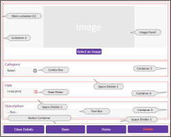
In the screenshot below, containers are highlighted red for clarity. The main container holds four separate containers for the Image Panel, Combo Box, Date Picker, and Text Box controls. A separate four-column container hosts the four buttons, Clear Details, Save, Home, and Delete.
Tip When you start to add content to the wep app pages, it's a good idea to save the page regularly. You can also make duplicate copies of the page at key stages to act as backups—see the Page section in Configuring a Web Application Version.
Adding controls to the page
When you add a control to the page, you can rename it to something more meaningful which will be easier to identify, or leave the system-generated default name. For example, you could rename the Containers below as container-main, container-imagepanel, and so on.
- Select and edit the Manage page you created. For help, see Page Designer.
- From the Layout section of the toolbox, drag and drop a Container onto the page; this is the main container. Select the container, and in the Appearance properties, set Columns to 1.
- Drag and drop a second Container for the Image Panel into the main container. In the Appearance properties, set Columns to 1.
- From the Common section of the toolbox, drag and drop an Image Panel into the container.
- Drag and drop a third Container for the Combo box into the main container, below the Image Panel. In the Appearance properties, set Columns to 1.
- From the Common section of the toolbox, drag and drop a Combo Box into the second container.
- From the Layout section of the Control toolbox, drag and drop a Space Dividerinto the main container, below the Combo Box.
- Drag and drop a fourth Container for the Date Picker into the main container, below the Space Divider. In the Appearance properties, set Columns to 1.
- From the Common section of the toolbox, drag and drop a Date Picker into the fourth container.
- Drag and drop a second Space Dividerinto the main container, below the Date Picker.
- Drag and drop a fifth Container for the Text Box into the main container, below the Space Divider. In the Appearance properties, set Columns to 1.
- From the Common section of the toolbox, drag and drop a Text Box into the fifth container. You could use a Text Area control instead for multi-line entry.
- Drag and drop a third Space Divider onto the page, after the main container.
- Drag and drop a Container onto the page, outside of the main container, below the third Space Divider; this is the button container. In the Appearance properties, set Columns to 4.
- From the Common section of the toolbox, drag and drop a Button into each of the four button container columns.
Configuring the controls
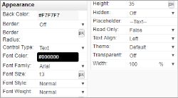
This section lists the configuration properties for each control in the tutorial example. Properties not shown use default values.
Layout
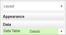
To enable controls on the page to be bound to columns in the data object you set the Layout Data property: Data Table, to the data object.
Space Dividers
Appearance
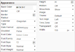
In the tutorial example, the Height property for each Space Divider is set to 15px.
Image Panel
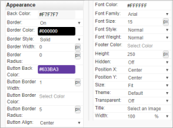
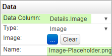
For more details about the Image Panel, see Image Panel Control.
Combo Box
Appearance
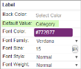
In the Appearance Label section, Default Value set the Combo Box label; "Category".
Data
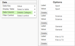
In Data properties, you set Data Column to bind the Combo Box to the data object column where categories are stored.
In the Data Options section, you define each drop-down category as a label-value pair. In our example, the label and value can be the same, and four categories are shown as examples.
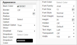
For more details about the Combo Box, see Combo Box Control.
Date Picker
Appearance
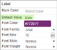
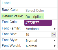
In the Appearance Label section, Default Value sets the Date Picker label; "Date".
Data
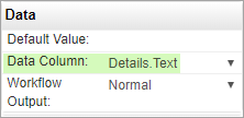
In Data properties, you set Data Column to bind the Date Picker to the data object column where dates are stored.
When Current Date is set to True, the Date Picker appears pre-populated with the current date.
For more details about the Date Picker, see Date Picker Control.
Text Box
For more details about the Text Box, see Text Box Control.
Buttons
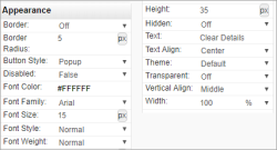
The four buttons are configured similarly. Screenshots in this section are for the Clear Details button, with the differences for each button described.
Appearance
For the four buttons, the Text fields are Clear Details, Save, Home, and Delete.
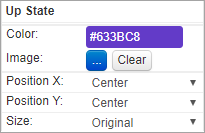
For all buttons, set the button colour in the Appearance Up State section. Repeat for the Down State and Hover State sections.
Behaviour
The Button Type for each of the four buttons is shown below.
Clear Details:

Save:

Home:

Delete:

Testing
- Open the Home page in the Page Designer, and run the Design Preview feature.
- In the web browser, on the Home page, click the New Record button and the Manage page should load. If it doesn't, check the button Behaviour properties.
- In the web browser, on the Manage page, select an image, a category, a date, and type a description of the event.
- Click Save and the Home page should load, showing the new item in the grid.
